Asana has got a new look, and that's what they had been working on for the past several months. Teams across the globe in every industry—from fast-growing tech companies like Pinterest and Uber, to organizations like the United Way and NASA, to global brands like Disney and Verizon—use Asana to achieve more than they could before. There’s more opportunity to make work even easier for you. So, after countless customer conversations, user experience studies, and prototypes, they built a new Asana.

Asana is a powerful product with a lot of features, and in the old Asana it could feel overwhelming to get started with your team. To fix that, the product needed some big changes. In fact, the number one request from customers was an improved design. The new Asana is redesigned to make tracking work to completion easier, so teams can get on board quickly and use Asana to achieve their goals. Asana is on a mission to help you and your team do great things together. By making it easy to keep track of your work, we give you more time to do the work that matters: building software, curing patients, cooking meals, or whatever it is your company does.

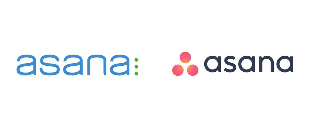
Asana’s 3 dots used to patiently wait in line at the deli counter, but now they’re working together on a common goal. Instead of a cool green, they’re now an empowering, warm coral, with a glow that conveys the active energy between the team. The letter forms, placement, and arrangement of our logo were crafted with purpose. If you look closely, you’ll notice that there are three dots equally spaced inside the “A” letters in our word mark.
The new Asana is the easiest way to track work, and get results.
Reference : Asana


