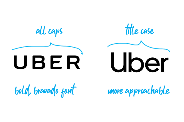
When asked about the (old) Uber logo yesterday, the CEO and co-founder Travis Kalanick commented : "Have you ever looked at someone's hairstyle and thought 'Oh my, you peaked in the 1990s?'" The company had got a new brand identity and has updated the App icons. The new logo as described by the CEO Mr. Kalanick, himself, is "at once more grounded and elevated." Compared to the previous logotype, there's tighter text spacing, heavier letter weights and the curves at the left tip of the letter U and the right tip of letter R is gone. "Some might say it's less fussy (in part because we have cut the curls, our 1990s hairstyle)," Mr. Kalanick wrote.
Our new look and feel celebrates both our technology and the cities we serve. This updated design reflects where we’ve been, and where we’re headed. The Uber you know isn’t changing, our brand is just catching up to who we already were. Travis Kalanick, CEO
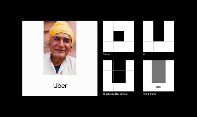
The bolder, more substantial logo is meant to make it more visible from afar and reflect Uber’s maturity as a company.
Along with the new wordmark, the company has dropped the “U” from its app symbol, replacing it with a white circle that partially encloses.
The design has philosophical origins: the square represents a “bit,” while the circle depicts an “atom”. “The unique aspect of Uber is that we exist in the physical world,” Mr. Kalanick explained. “We exist in the place where bits and atoms come together. That is Uber. We are not just technology but technology that moves cities and their citizens.”
That “bit” will also be a running theme in Uber’s partner apps, as seen in the hexagonal shape that encloses a square for the driver logo.
The new identity also introduces much more colour to the brand. Whereas before it was simply black and white a lil bit of blue, it now features a more vibrant palette and patterns, all of which will be localized and tailored to each country Uber serves. Uber, being a transportation network woven intot he fabric of cities, there is a drastic change from the black and white Uber. After months researching on textures, art, fashion, architecture, people and a lot more, specific to the cities, Uber came up with attractive geometric patterns and bright colours.

