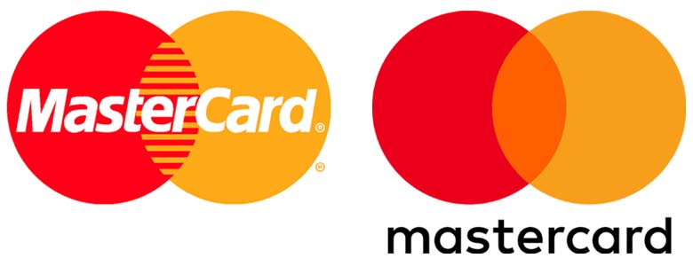
MasterCard's (known as Interbank in 1966 and MasterCharge till 1979) logo and the name have changed since 1968, and at the core, the two overlapping circles in shades of red and yellow have remained the same. MasterCard is undoubtedly one of the unique brands and most recognizable brand marks appearing on millions of cash machines and billions of credit cards.
“To thrive in this new digital world where business moves faster than ever, we want to modernize and elevate the brand in a design that is simple and elegant, yet unquestionably Mastercard.”, said Raja Rajamannar, chief marketing and communications officer, Mastercard. In an attempt to tackle this, Pentagram designed a new logo for the brand. Gone are the italics, they introduced FF Mark in typeface and retained the red and yellow circles, but with a brighter shade. What is most striking is they removed the stripes the brand identity has since more than two decades, making the identity more recognizable and simple.

“We haven’t touched our brand mark for about 20 years now and the company has changed really dramatically in that time,” says Chuck Breuel, VP Brand Marketing at MasterCard. “We’ve expanded all of our products and services and that’s really accelerated over the past few years, so we took a look at the logo and said, ‘I think we can do some things to have it more closely reflect where the company is’. To make it simpler, more impactful in a way, but still instantly recognizable,” he says.
Overall, the new look is a clean break for Mastercard to establish a clear house style that stems from the simplicity and crispness of the new logo.


